Club Crimsyn
The 'Y' Makes It Hip
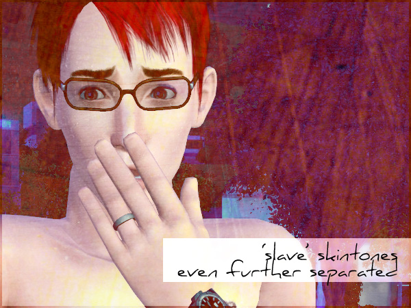
Default Replacement Skintones for TS3 - Even More Separated 
1st-Jul-2009 01:56 pm
TS3 - Bunny Slipper


By request, these are my default skintones even further separated. They're now available individually as faces and bodies for males and females, teens through elder, as well as toddlers and children. Toddlers and children are not separated into males or females as far as skintones go.

Faces:

Males
Females
Toddlers/Children

Bodies:

'Barbie':
Males
Females

Anatomical:
Males
Females

Children
Comments 
2nd-Jul-2009 12:33 am (UTC)
default, madmen
Thank you! :)
2nd-Jul-2009 12:34 am (UTC)
ville
You're seriously awesome.

*leaves a cookie*
2nd-Jul-2009 07:03 pm (UTC)
Calvin & Hobbes
Thank you so much! Also, quick question - I love your male faces, but there's a lot of distortion on the female version (especially around the eyes, nose, etc). Can I have permission to 'fix' it? I will, of course, link back to your DW.
2nd-Jul-2009 07:56 pm (UTC)
TS3 - Aikea - Think
Really? How so? I haven't noticed anything like that myself. Not saying you're not experiencing it, or claiming I'm perfect and never mess things up (ha!), I'm honestly curious! (Actually, in checking the original files against each other, I just noticed I made the faces based off the female face, which makes it even weirder.)

Regardless, if you want to try fixing it, go for it! :D
2nd-Jul-2009 08:49 pm (UTC)
Calvin & Hobbes
Ah, I'm definitely not saying these aren't good - they're far better than anything I can come up with, 'fo sho. I think it's just a minor stylistic preference of mine. On some of my female sims, there's a noticeable dark stroke above the tearduct. It actually looks great on some sims, but on certain ladies with particular facial characteristics (deeper nose bridges, different eye apexes, etc.) the stroke looks sort of out of place.

It's less noticeable in certain lighting than others, though. Not really a big deal, but I guess I just have the 'perfectionist' trait. :P
2nd-Jul-2009 09:47 pm (UTC)
TS3 - Pie
You know what, I'm wondering if that's something you can even change on the files I've edited, or if it's one of the other 'effects' textures. I've noticed a bit of it on the area under the nose and above the lips, and it's something I was going to look into changing. It's nothing on the actual multiplier files I've edited, however. *squints at* Maybe.

AT ANY RATE... let me know if anything you change makes a difference! XD
4th-Jul-2009 03:31 am (UTC)
Calvin & Hobbes
Here, I took a crack at it. This is by no means a professional edit, by the way, as I basically re-handpainted every image on my tablet. There's probably a more efficient/accurate way of doing this, but whatever - all I wanted to do was make a tiny change. :D

I removed it, but I also removed some of the detail around the eyes. Bugger, it looks like the original EA pudding textures. I'd like to think it was a good effort anyway. :P Here's the full version (not separated) if you wanna take a look.

http://www.mediafire.com/download.php?mhmzmyyrm21
6th-Jul-2009 10:53 pm (UTC)
TS3- Unicorn
I'll definitely take a look at it when I get some time. Thanks for uploading!
This page was loaded Jun 5th 2010, 6:18 am GMT.