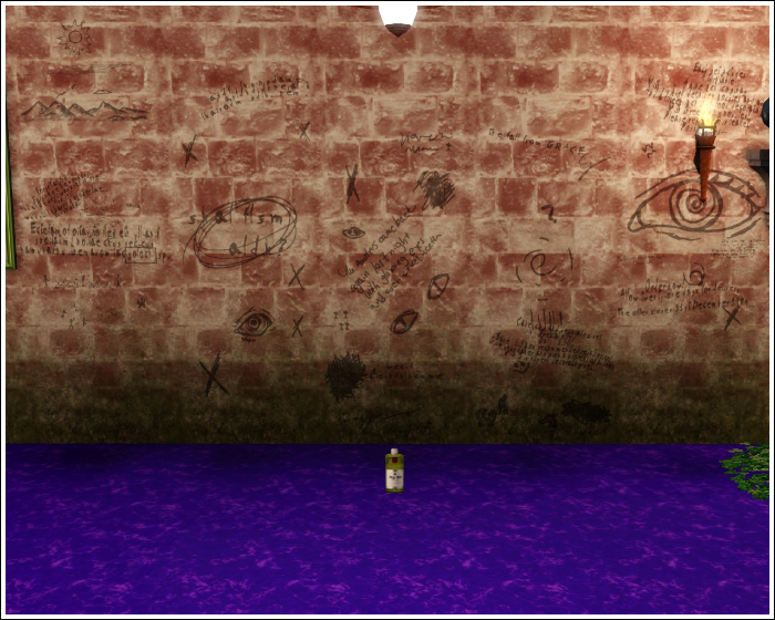
This has been an ongoing project of mine pretty much since the release of TS3. Unfortunately, it's proving to be a bit of a pain in the ass.
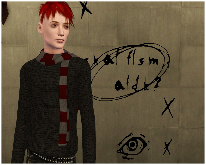
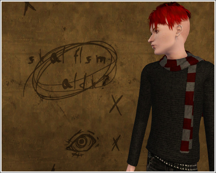
First, sorry about RandomJacob. I wasn't planning on posting any WIP-type pictures of this until things started to fight back, so originally these were just random for-me type pics.

With the standard TS3 alpha-ing, the letters are nice and black, but their edges aren't smooth in the least. This would be fine for things like square signs, but on writing, the effect is just not very nice.

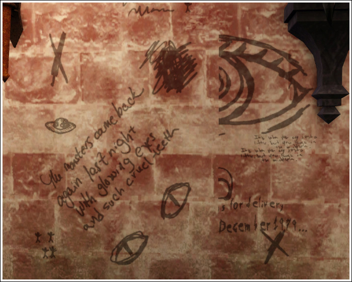
I got the edges to smooth out by switching around some mtlsrc files, but this led to the letters taking on a slightly transparent look no matter how dark they were. I was ready to post these at this point, and then I noticed...

They don't layer. At all. This really annoyed me, since one of the things I liked most about the TS2 version of these was their ability to be overlaid with one another.
I'm going to continue to work on these issues, but if they can't be resolved for whatever reason, are these issues bad enough that you'd avoid downloading them if released? I'm mostly just curious how picky people are about things. Personally, I can't stand releasing something if it doesn't work exactly how I want it to.